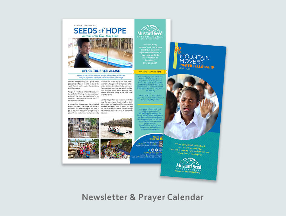
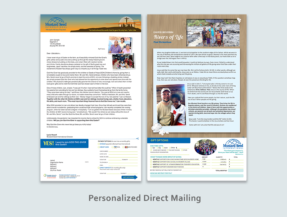
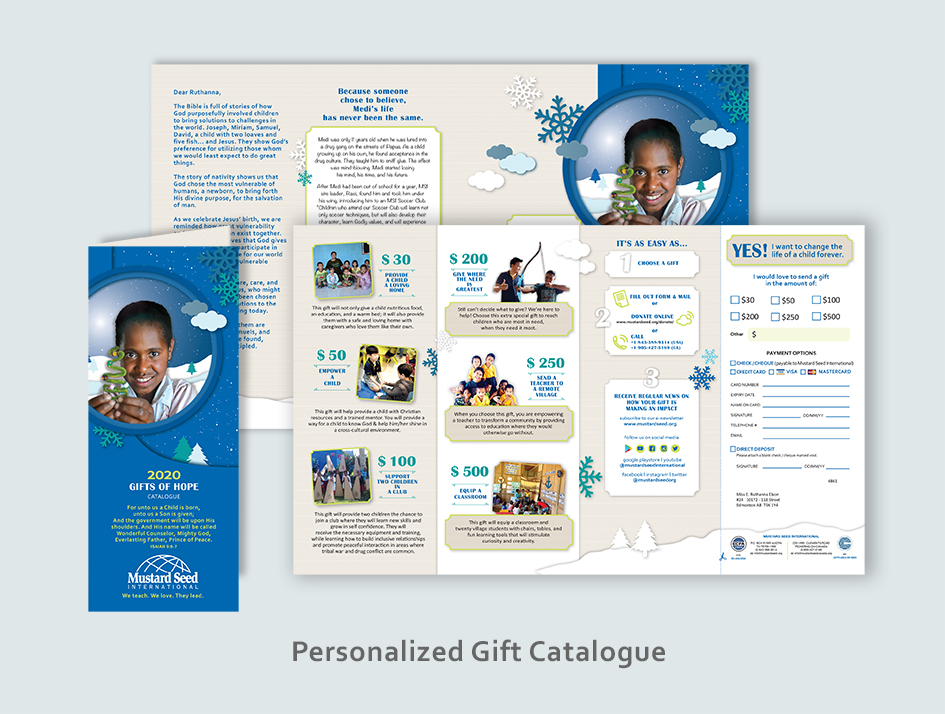
Mustard Seed International is a North America non-profit organization that empowers generation and estabishes thriving communities through a holistic model of transformative Christian education
The Challenge
With an aging donor and supporter, Mustard Seed seeks to reach out to the younger generation of North America while maintaining personal communication with existing non-digital donors.
My Approach
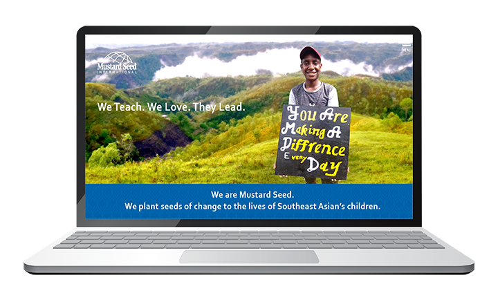
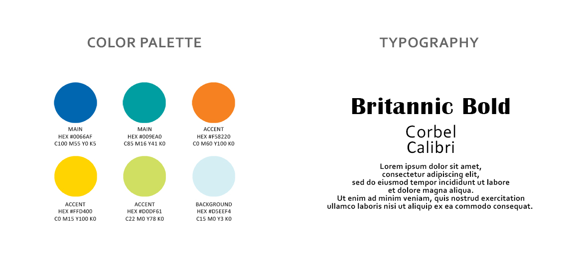
My approach was to develop new organization branding and communication. Part of that was setting up a new color palette for both digital and print production, and designing & building a website to accommodate the virtual audience.
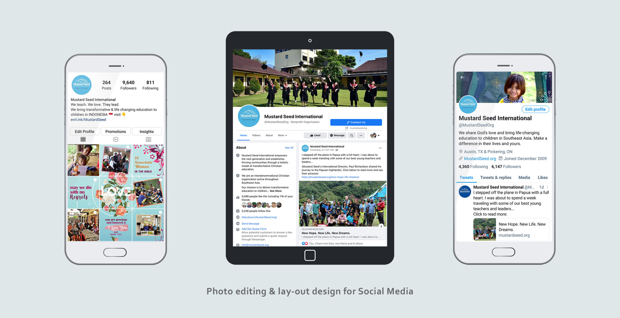
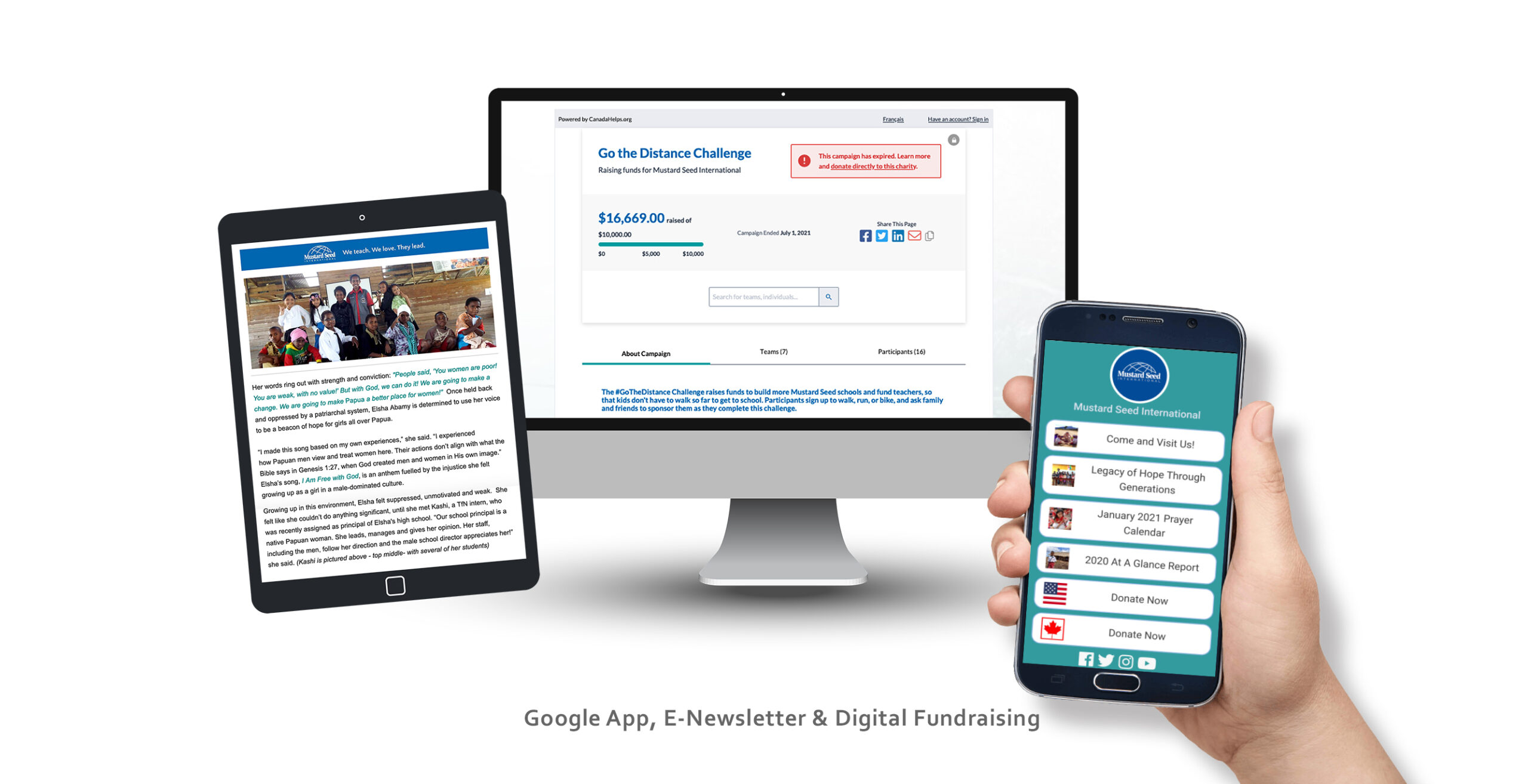
Color palette and typography were developed to create a younger and fresher look. Communication strategy built to reach out to both online and offline audiences. While maintaining regular updates through the website and social media, print publication through the newsletters and direct mailing was chosen to create personalized gestures.
The donation portals on the website were set up to accommodate both the US and Canadian supporters.

Lisa’s extensive computer design skills were critical in assisting us during this time when communications were of utmost importance. She was able to take input from many people, yet independently design complex communication. Everyone who worked with Lisa, including the directors of our board, was amazed at how quickly she came to understand the mission of Mustard Seed and how ahe applied creativity in all aspect of her work.
- Lucie Howell,Canadian Director, Mustard Seed International -
Reception
I think the new Mustard Seed pamphlet is brilliant! First of all colour, the child on the front, then opening to the child in the country, colour contrast again, one’s eye is drawn to the child then his testimony, almost best of all is the foldout to the map of Indonesia. Specifics are on the outer folds where the variety of fonts make reading easy. Colour and colour contrasts, fonts, simplicity of design. So…my assessment: appealing and welcoming. Well done Mustard Seed – Jess @email
Loved the new format. I tend to binge read it, but it really got my attention. With each passing year, the standard for graphic art changes and we’ve always got to try to stay as current as we can just to keep peoples’ attention – Wilkinson @email

